Site Editor Drag-n-Drop Features
- How to Add Heading to Your Page ?
- How to Add Free Text to Your Page ?
- How to Add Image to Your Page ?
- How to Add Button to Your Page ?
- How to Add Gallery to Your Page ?
- How to Add Map to Your Page ?
- How to Add Text Containers to Your Page ?
- How to Add Counter to Your Page ?
- How to Add Divider to Your Page ?
- How to Add Testimonial to Your Page ?
- How to Add Sections to Your Page ?
- How to Add Div Container to Your Page?
- How to Add Video to Your Page ?
- How to Add Tabs to Your Page ?
- How to Add Accordions to Your Page ?
- How to Add Subscribe Feature to Your Page?
- How to Add Contact Form to Your Page ?
How to Add Heading to Your Page ?
Through this document , you will uncover the 'Heading' feature properties in site editor page through two key elements:
1. Adding a Heading
2. Feature Settings Window
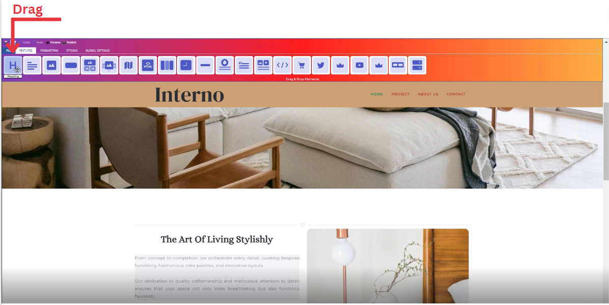
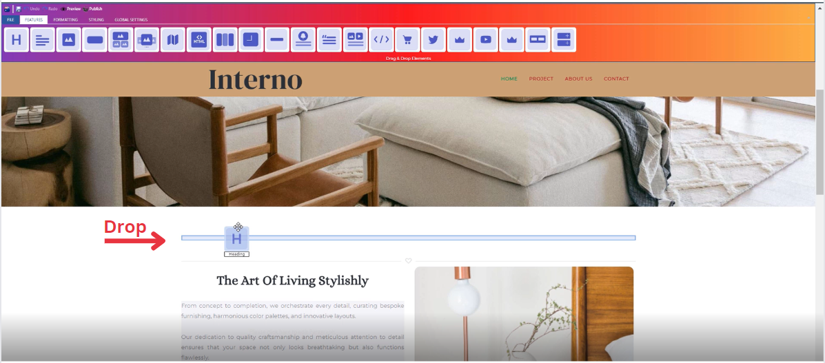
Adding a Heading
-
Drag the Heading icon from the available features
-
Drop the Heading icon into the desired location on your website page
Feature Settings Window
Upon dropping the heading, a settings window will appear, offering four main features:
-
Theme
-
Explore different themes for your heading to align with your website's aesthetic
-
____________________________________________________________________________
-
Settings
-
Customize and enter your own text
-
Add several classes from a long list of options
-
Select heading level (H1,H2,H3,H4,H5)
-
Determine how your heading is visible on devices (Mobile , Tablet , Desktop , Large desktop)
-
_____________________________________________________________________________
-
Design
-
Determine the font type
-
Determine font color with gradient
-
_____________________________________________________________________________
-
Animation
-
Add animation to your text from a long list of animation options
-
Enhance your animated text by incorporating timing in seconds
-
How to Add Free Text to Your Page ?
Through this document , you will uncover the 'Text' feature properties in site editor page through these key elements:
1. Adding a Free Text
2. Feature Settings Window
3. Style Settings Window
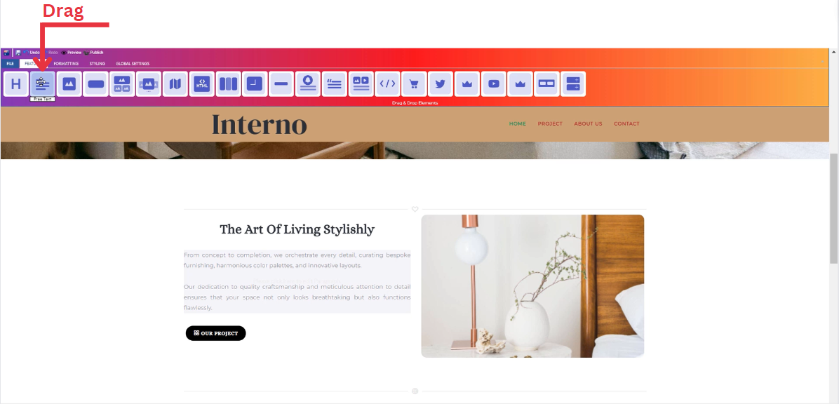
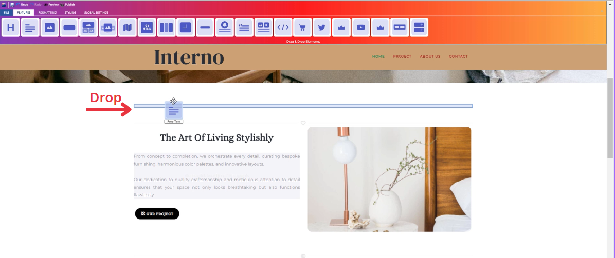
Adding a Free Text
-
Drag the text icon from the available features
-
Drop the text icon into the desired location on your website page
Feature Settings
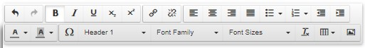
Once the text icon is activated, you can start entering your desired text directly into the text field. And upon entering text, a feature settings window will appear, providing options for customization.
This window includes :
-
Customize Font: In the feature settings, customize your text by selecting from various font families, adjusting font sizes, and choosing different headers.
-
Text Alignment: Modify the alignment of your text as needed, whether it's left-aligned, center-aligned, right-aligned, or justified.
-
Lists: Utilize numbered and bullet lists to organize your text content efficiently.
-
Insert/Edit Links: Add hyperlinks to your text by using the insert/edit link option, allowing users to navigate to external pages or resources.
-
Remove Links: If needed, easily remove any existing links within your text.
-
Subscript and Superscript: Apply subscript or superscript formatting to specific text elements for a more dynamic presentation.
-
Text Color: Customize the color of your text to match your website's design or emphasize specific information.
-
Background Color: Enhance the visibility of your text by adjusting the background color to create a visually appealing contrast.
-
Special Characters: Access a range of special characters to enhance the richness of your text content.
-
Additional Features: Explore other available features to further enhance your text, ensuring a comprehensive and polished appearance.
Style Settings
Design Features
-
Access the "Design" feature to customize your text appearance. Within this feature, you can determine the following properties:
-
Margin: Set the spacing around your text to control its placement on the page.
-
Border: Define a border for your text to add a distinct visual element.
-
Color: Choose the color that best complements your website's theme or design.
-
Style: Apply different styles to your text, enhancing its visual appeal.
-
Gradient: Add gradient effects to your text for a more dynamic and modern look.
-
Background Features
Style Customization
- Within the "Style" section, further refine your text presentation by adding classes from a dropdown list with a plethora of options
- Determine how your text is visible on devices (Mobile , Tablet , Desktop , Large desktop)
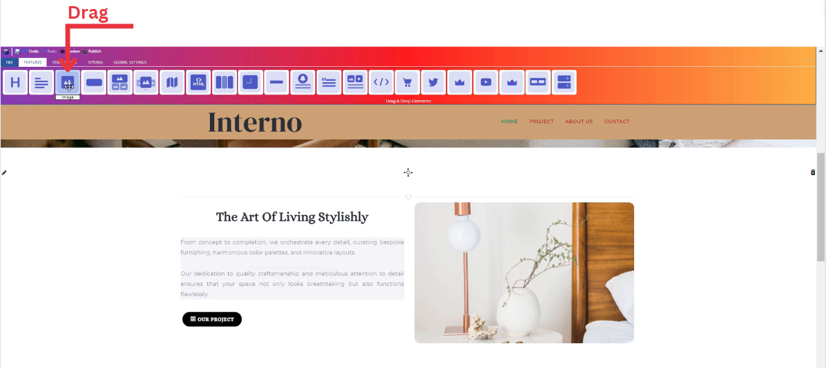
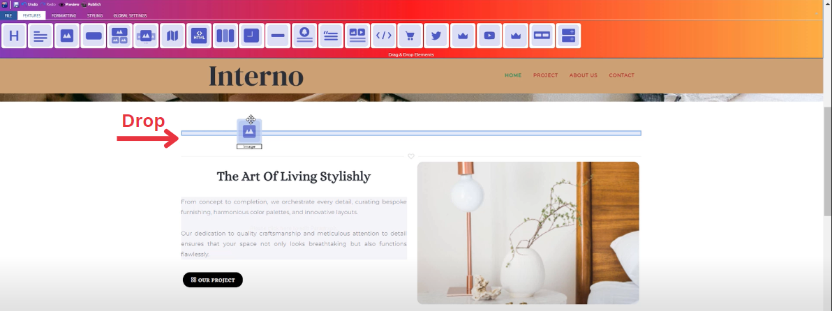
How to Add Image to Your Page ?
Through this document , you will uncover the 'Image' feature properties in site editor page through these key elements:
1. Adding an Image
2. Feature Settings Window
3. Style Settings Window
Adding an Image
-
Drag the Image icon from the available features
-
Drop the Image icon into the desired location on your website page
Feature Settings
Upon dropping the image , a settings window will appear, offering three main features:
-
Images
-
Include an image on your website by choosing from three options: select from your uploaded images, use sample images from the website, or upload a new image.
-
____________________________________________________________________________
-
Settings
-
Customize your image dimensions (Width , Height).
-
Determine how your image is visible on devices (Mobile , Tablet , Desktop , Large desktop).
-
____________________________________________________________________________
-
Animations
-
Add animation to your image from a long list of animation options.
-
Enhance your animated image by incorporating timing in seconds.
-
Style Settings
Design Features
-
Access the "Design" feature to customize your image appearance. Within this feature, you can determine the following properties:
-
Margin: Set the spacing around your image to control its placement on the page.
-
Border: Define a border for your image to add a distinct visual element.
-
Color: Choose the color that best complements your website's theme or design.
-
Style: Apply different styles to your image, enhancing its visual appeal.
-
Gradient: Add gradient effects to your button for a more dynamic and modern look.
-
Background Features
Style Customization
- Within the "Style" section, further refine your button presentation by adding classes from a dropdown list with a plethora of options.
- Determine how your image is visible on devices (Mobile , Tablet , Desktop , Large desktop).
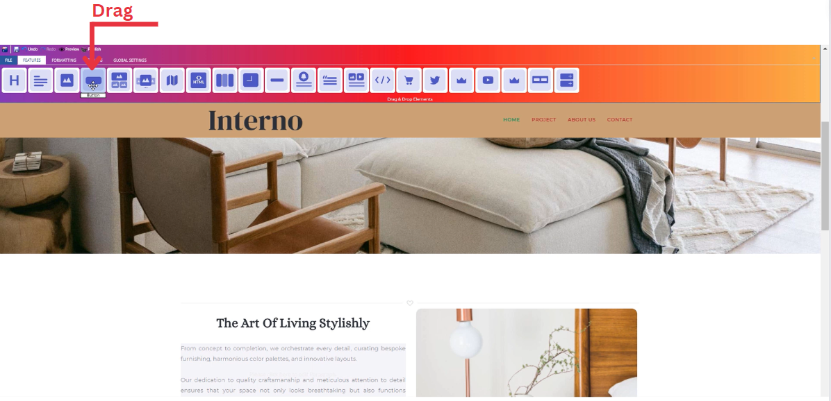
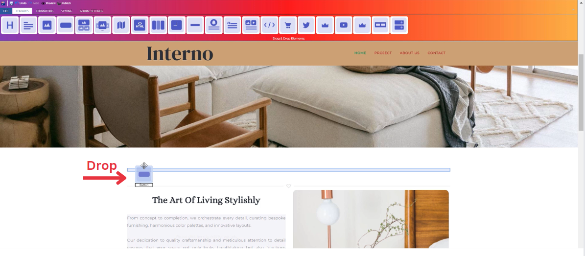
How to Add Button to Your Page ?
Through this document , you will uncover the 'Button' feature properties in site editor page through these key elements:
1. Adding a Button
2. Feature Settings Window
3. Style Settings Window
Adding a Button
-
Drop the Heading icon into the desired location on your website page
Feature Settings
Upon dropping the button, a settings window will appear, offering four main features:
-
Theme
-
Explore different themes for your button to align with your website's aesthetic.
-
____________________________________________________________________________
-
Settings
-
Customize and enter your own text/title and long description.
-
Select the button size (Normal , Mini , Small , Large , Extra Large).
- Add several classes from a long list of options.
-
Determine how your button is visible on devices (Mobile , Tablet , Desktop , Large desktop).
-
____________________________________________________________________________
-
Design
-
Customize the font type of your title and description
-
____________________________________________________________________________
Style Settings
Design Features
-
Access the "Design" feature to customize your button appearance. Within this feature, you can determine the following properties:
-
Margin: Set the spacing around your button to control its placement on the page.
-
Border: Define a border for your button to add a distinct visual element.
-
Color: Choose the color that best complements your website's theme or design.
-
Style: Apply different styles to your button, enhancing its visual appeal.
-
Gradient: Add gradient effects to your button for a more dynamic and modern look.
-
Background Features
Style Customization
- Within the "Style" section, further refine your button presentation by adding classes from a dropdown list with a plethora of options.
- Determine how your button is visible on devices (Mobile , Tablet , Desktop , Large desktop).
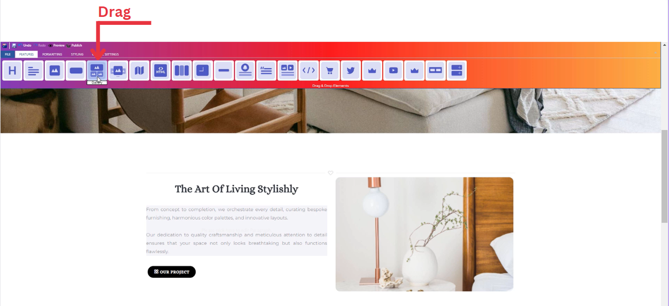
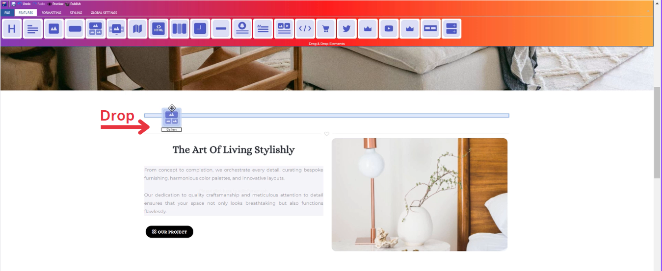
How to Add Gallery to Your Page ?
Through this document , you will uncover the 'Gallery' feature properties in site editor page through these key elements:
1. Adding a Gallery
2. Feature Settings Window
3. Style Settings Window
Adding a Gallery
-
Drop the Gallery icon into the desired location on your website page
Feature Settings
Upon dropping the gallery, a settings window will appear, offering four main features:
-
Images
-
Include images for your gallery on your website by choosing from three options: select from your uploaded images, use sample images from the website, or upload new images.
-
____________________________________________________________________________
-
Settings
-
Customize your gallery global settings through selecting the number of columns.
-
Determine how your image is visible on devices (Mobile , Tablet , Desktop , Large desktop).
-
____________________________________________________________________________
-
Design
-
Customize the design of each image in your gallery in terms of :
- Margin
- Padding
- Border
- Color
- Style
-
____________________________________________________________________________
-
Animations
-
Add animation to your gallery's title and long text from a long list of animation options.
- Enhance your animations image by incorporating timing in seconds
-
Style Settings
Design Features
-
Access the "Design" feature to customize your gallery appearance. Within this feature, you can determine the following properties:
-
Margin: Set the spacing around your gallery to control its placement on the page.
-
Border: Define a border for your gallery to add a distinct visual element.
-
Color: Choose the color that best complements your website's theme or design.
-
Style: Apply different styles to your gallery, enhancing its visual appeal.
-
Gradient: Add gradient effects to your gallery for a more dynamic and modern look.
-
Background Features
Style Customization
- Within the "Style" section, further refine your button presentation by adding classes from a dropdown list with a plethora of options.
- Determine how your gallery is visible on devices (Mobile , Tablet , Desktop , Large desktop).
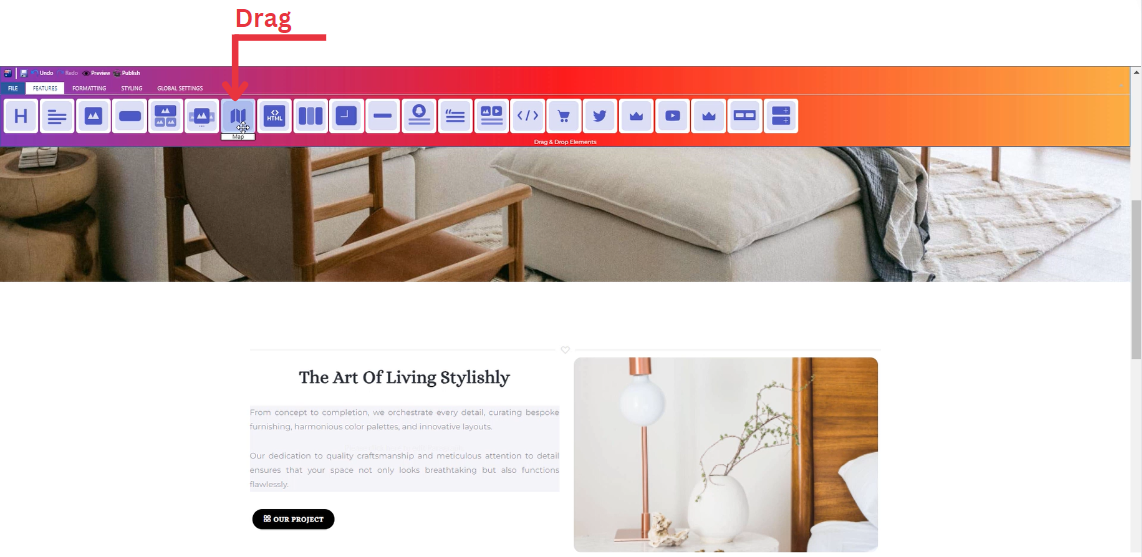
How to Add Map to Your Page ?
Through this document , you will uncover the 'Map' feature properties in site editor page through these key elements:
1. Adding a Map
2. Feature Settings Window
3. Style Settings Window
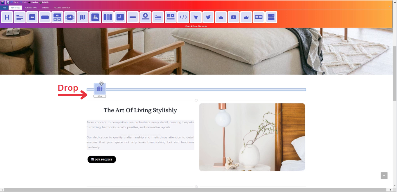
Adding a Map
- Drag the map icon from the available features
- Drop the map icon into the desired location on your website page
Feature Settings
-
Settings
-
Determine your address and description details.
-
Determine how your map is visible on devices (Mobile , Tablet , Desktop , Large desktop).
-
____________________________________________________________________________
-
Design
-
Customize your map dimensions (Width , Height).
-
____________________________________________________________________________
-
Animations
-
Add animation to your map from a long list of animation options.
-
Enhance your animated map by incorporating timing in seconds.
-
Style Settings
Design Features
-
Access the "Design" feature to customize your map appearance. Within this feature, you can determine the following properties:
-
Margin: Set the spacing around your map to control its placement on the page.
-
Border: Define a border for your map to add a distinct visual element.
-
Color: Choose the color that best complements your website's theme or design.
-
Style: Apply different styles to your map, enhancing its visual appeal.
-
Gradient: Add gradient effects to your map for a more dynamic and modern look.
-
Background Features
Style Customization
- Within the "Style" section, further refine your map presentation by adding classes from a dropdown list with a plethora of options.
- Determine how your map is visible on devices (Mobile , Tablet , Desktop , Large desktop.
How to Add Text Containers to Your Page ?
Through this document , you will uncover the 'Container' feature properties in site editor page through these key elements:
1. Adding a Container
2. Feature Settings Window
3. Style Settings Window
Adding a Container
Container feature allows you to add several numbers of text containers from (1 - 4).
- One container : Add one block of paragraph/text.
- Two containers : Add two blocks of paragraph/text.
- Three containers : Add three blocks of paragraph/text.
- Four containers : Add four blocks of paragraph/text.
Feature Settings
Once the container icon is activated, you can start entering your desired text directly into the text block. And upon entering text, a feature settings window will appear, providing options for customization.
This window includes :
-
Customize Font: In the feature settings, customize your text by selecting from various font families, adjusting font sizes, and choosing different headers.
-
Text Alignment: Modify the alignment of your text as needed, whether it's left-aligned, center-aligned, right-aligned, or justified.
-
Lists: Utilize numbered and bullet lists to organize your text content efficiently.
-
Insert/Edit Links: Add hyperlinks to your text by using the insert/edit link option, allowing users to navigate to external pages or resources.
-
Remove Links: If needed, easily remove any existing links within your text.
-
Subscript and Superscript: Apply subscript or superscript formatting to specific text elements for a more dynamic presentation.
-
Text Color: Customize the color of your text to match your website's design or emphasize specific information.
-
Background Color: Enhance the visibility of your text by adjusting the background color to create a visually appealing contrast.
-
Special Characters: Access a range of special characters to enhance the richness of your text content.
-
Additional Features: Explore other available features to further enhance your text, ensuring a comprehensive and polished appearance.
Style Settings
Design Features
-
Access the "Design" feature to customize your container appearance. Within this feature, you can determine the following properties:
-
Margin: Set the spacing around your container to control its placement on the page.
-
Border: Define a border for your container to add a distinct visual element.
-
Color: Choose the color that best complements your website's theme or design.
-
Style: Apply different styles to your container, enhancing its visual appeal.
-
Gradient: Add gradient effects to your container for a more dynamic and modern look.
-
Background Features
Style Customization
- Within the "Style" section, further refine your container presentation by adding classes from a dropdown list with a plethora of options.
- Determine how your container is visible on devices (Mobile , Tablet , Desktop , Large desktop.
How to Add Counter to Your Page ?
Through this document , you will uncover the 'Counter' feature properties in site editor page through these key elements:
1. Adding a Counter
2. Feature Settings Window
3. Style Settings Window
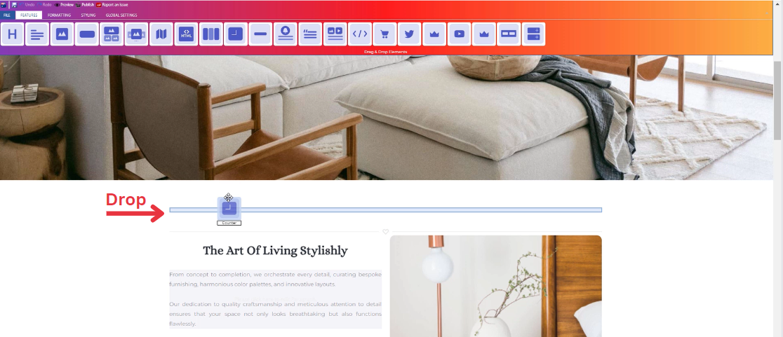
Adding a Counter
- Drag the counter icon from the available features
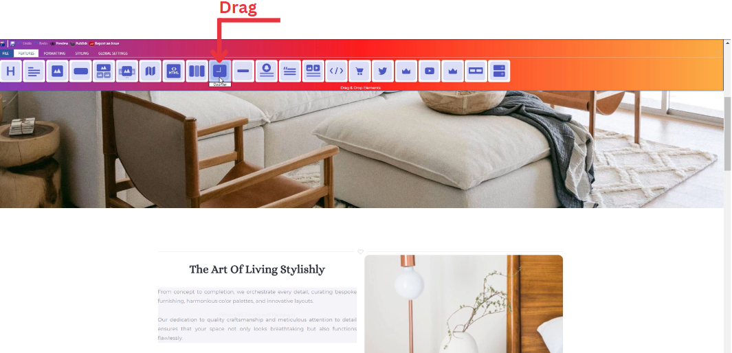
- Drop the counter icon into the desired location on your website page
Feature Settings
Upon dropping the counter, a settings window will appear, offering three main features:
-
Settings
- Settings : Customize the start number, end number, step, and speed for your counter.
- Start Number: Input the desired start number value.
- End Number: Input the desired end number value.
- Step: Input the desired values to define the counting range and interval.
- Speed : Adjust the speed setting to control how fast the counter increments.
____________________________________________________________________________
-
Design
-
Select your title font type from a long list of options
-
____________________________________________________________________________
-
Animations
-
Add animation to your title from a long list of animation options.
-
Enhance your animated title by incorporating timing in seconds.
-
Style Settings
Design Features
-
Access the "Design" feature to customize your counter appearance. Within this feature, you can determine the following properties:
-
Margin: Set the spacing around your counter to control its placement on the page.
-
Border: Define a border for your counter to add a distinct visual element.
-
Color: Choose the color that best complements your website's theme or design.
-
Style: Apply different styles to your counter, enhancing its visual appeal.
-
Gradient: Add gradient effects to your counter for a more dynamic and modern look.
-
Background Features
Style Customization
- Within the "Style" section, further refine your counter presentation by adding classes from a dropdown list with a plethora of options.
- Determine how your counter is visible on devices (Mobile , Tablet , Desktop , Large desktop.
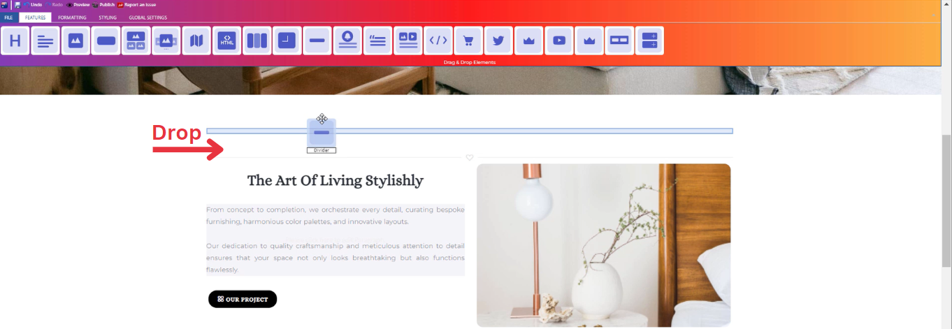
How to Add Divider to Your Page ?
Through this document , you will uncover the 'Divider' feature properties in site editor page through these key elements:
1. Adding a Divider
2. Feature Settings Window
3. Style Settings Window
Adding a Divider
- Drag the divider icon from the available features
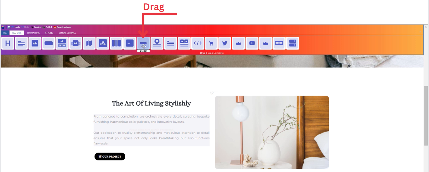
- Drop the divider icon into the desired location on your website page
Feature Settings
Upon dropping the divider, a settings window will appear, offering four main features:
-
Themes
-
Explore different themes for your divider to align with your website's aesthetic.
-
____________________________________________________________________________
-
Settings
- Determine how your divider is visible on devices (Mobile , Tablet , Desktop , Large desktop).
____________________________________________________________________________
-
Icons
- Select the icon of your divider that align with your website.
____________________________________________________________________________
-
Animations
-
Add animation to your title from a long list of animation options.
-
Enhance your animated title by incorporating timing in seconds.
-
Style Settings
Design Features
-
Access the "Design" feature to customize your divider appearance. Within this feature, you can determine the following properties:
-
Margin: Set the spacing around your divider to control its placement on the page.
-
Border: Define a border for your divider to add a distinct visual element.
-
Color: Choose the color that best complements your website's theme or design.
-
Style: Apply different styles to your divider, enhancing its visual appeal.
-
Gradient: Add gradient effects to your divider for a more dynamic and modern look.
-
Background Features
Style Customization
- Within the "Style" section, further refine your divider presentation by adding classes from a dropdown list with a plethora of options.
- Determine how your divider is visible on devices (Mobile , Tablet , Desktop , Large desktop.
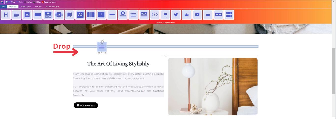
How to Add Testimonial to Your Page ?
Through this document , you will uncover the 'Testimonial' feature properties in site editor page through these key elements:
1. Adding a Testimonial
2. Feature Settings Window
3. Style Settings Window
Adding a Testimonial
- Drag the testimonial icon from the available features
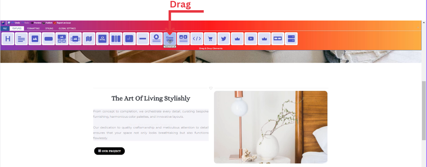
- Drop the testimonial icon into the desired location on your website page
Feature Settings
Upon dropping the testimonial, a settings window will appear, offering four main features:
-
Images
-
Include images for your testimonial on your website by choosing from three options: select from your uploaded images, use sample images from the website, or upload new images.
-
____________________________________________________________________________
-
Settings
-
Enter the person name , description ,and company name.
- Determine how your testimonial is visible on devices (Mobile , Tablet , Desktop , Large desktop).
-
____________________________________________________________________________
-
Design
-
Select your texts font type from a long list of options.
- Determine different design features of your testimonial (Margin , Padding , Border , Color , Style , Font)
-
____________________________________________________________________________
-
Animations
-
Add animation to your person name and description from a long list of animation options.
-
Enhance your animated texts by incorporating timing in seconds.
-
Style Settings
Design Features
-
Access the "Design" feature to customize your testimonial appearance. Within this feature, you can determine the following properties:
-
Margin: Set the spacing around your testimonial to control its placement on the page.
-
Border: Define a border for your testimonial to add a distinct visual element.
-
Color: Choose the color that best complements your website's theme or design.
-
Style: Apply different styles to your testimonial, enhancing its visual appeal.
-
Gradient: Add gradient effects to your testimonial for a more dynamic and modern look.
-
Background Features
Style Customization
- Within the "Style" section, further refine your testimonial presentation by adding classes from a dropdown list with a plethora of options.
- Determine how your testimonial is visible on devices (Mobile , Tablet , Desktop , Large desktop.
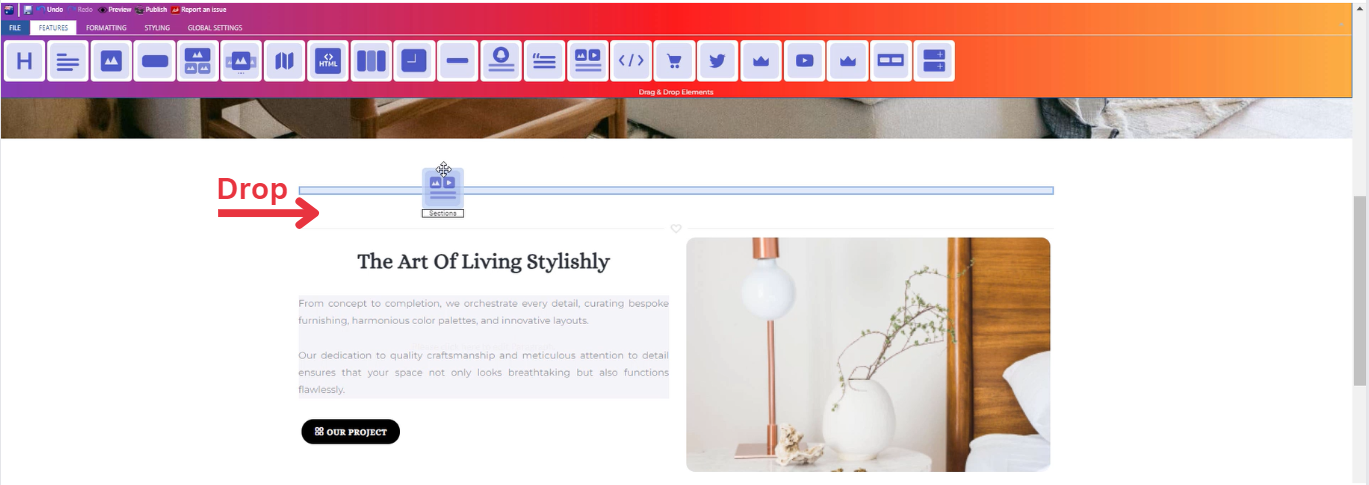
How to Add Sections to Your Page ?
Through this document , you will uncover the 'Sections' feature properties in site editor page through these key elements:
1. Adding Sections
2. Feature Settings Window
3. Style Settings Window
Adding Sections
- Drag the sections icon from the available features
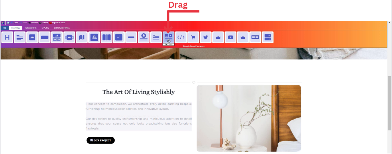
- Drop the sections icon into the desired location on your website page
Feature Settings
Upon dropping the sections, a settings window will appear, offering four main features:
-
Themes
-
Explore different themes for your sections to align with your website's aesthetic.
-
____________________________________________________________________________
-
Settings
- Enter your texts (title and long text) and add several classes from a long list of options.
-
Select heading level (H1,H2,H3,H4,H5)
-
Determine how your sections are visible on devices (Mobile , Tablet , Desktop , Large desktop).
____________________________________________________________________________
-
Design
-
Customize the font type of your title and description.
-
Add gradient to your title and description.
-
____________________________________________________________________________
-
Animations
-
Add animation to your title and description from a long list of animation options.
-
Enhance your animated title and description by incorporating timing in seconds.
-
Style Settings
Design Features
-
Access the "Design" feature to customize your sections appearance. Within this feature, you can determine the following properties:
-
Margin: Set the spacing around your sections to control its placement on the page.
-
Border: Define a border for your sections to add a distinct visual element.
-
Color: Choose the color that best complements your website's theme or design.
-
Style: Apply different styles to your sections, enhancing its visual appeal.
-
Gradient: Add gradient effects to your sections for a more dynamic and modern look.
-
Background Features
Style Customization
- Within the "Style" section, further refine your sections presentation by adding classes from a dropdown list with a plethora of options.
- Determine how your sections are visible on devices (Mobile , Tablet , Desktop , Large desktop).
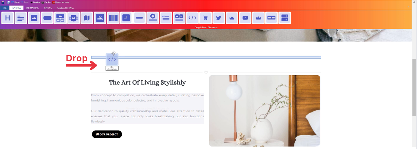
How to Add Div Container to Your Page?
Through this document , you will uncover the 'Div Container' feature properties in site editor page through these key elements:
1. Adding a Div Container
2. Feature Settings Window
3. Section Test Settings Window
Adding a Div Container
- Drag the div container icon from the available features
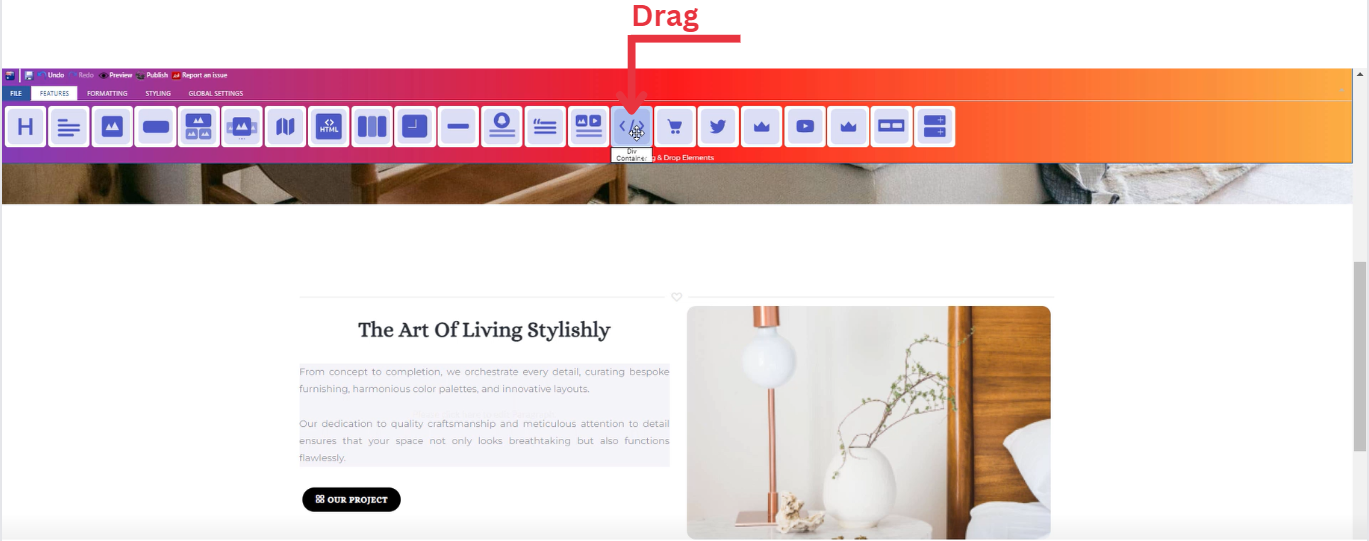
- Drop the div container icon into the desired location on your website page
Feature Settings
Upon dropping the div container, a settings window will appear, offering three main features:
-
Settings
-
Add several classes from a long list of options.
-
Determine how your heading is visible on devices (Mobile , Tablet , Desktop , Large desktop).
-
-
Design
-
Include images for your div container on your website by choosing from three options: select from your uploaded images, use sample images from the website, or upload new images.
-
-
Animations
-
Add animation to your div container from a long list of animation options.
-
Enhance your animated div container by incorporating timing in seconds.
-
Section Test Settings
Once the div container icon is activated, you can start entering your desired text directly into the section test. And upon entering text, a window will appear, providing options for customization.
This window includes :
-
Customize Font: In the feature settings, customize your text by selecting from various font families, adjusting font sizes, and choosing different headers.
-
Text Alignment: Modify the alignment of your text as needed, whether it's left-aligned, center-aligned, right-aligned, or justified.
-
Lists: Utilize numbered and bullet lists to organize your text content efficiently.
-
Insert/Edit Links: Add hyperlinks to your text by using the insert/edit link option, allowing users to navigate to external pages or resources.
-
Remove Links: If needed, easily remove any existing links within your text.
-
Subscript and Superscript: Apply subscript or superscript formatting to specific text elements for a more dynamic presentation.
-
Text Color: Customize the color of your text to match your website's design or emphasize specific information.
-
Background Color: Enhance the visibility of your text by adjusting the background color to create a visually appealing contrast.
-
Special Characters: Access a range of special characters to enhance the richness of your text content.
-
Additional Features: Explore other available features to further enhance your text, ensuring a comprehensive and polished appearance.
How to Add Video to Your Page ?
Through this document , you will uncover the 'Video' feature properties in site editor page .
Vimeo
YouTube
Daily Motion
HTML 5 Video
Sound Cloud
Vimeo
Feature Settings
Upon dropping the Vimeo icon , a settings window will appear, offering three main features:
- Settings
-
-
Add your video link
- Determine how your video is visible on devices (Mobile , Tablet , Desktop , Large desktop).
-
-
____________________________________________________________________________
-
Video
-
Include videos on your website by choosing from two options: select from your uploaded videos or upload new videos
-
____________________________________________________________________________
-
Animations
-
Add animation to your video box from a long list of animation options.
-
Enhance your animated video box by incorporating timing in seconds.
-
Style Settings
Design Features
-
Access the "Design" feature to customize your video box appearance. Within this feature, you can determine the following properties:
-
Margin: Set the spacing around your video box to control its placement on the page.
-
Border: Define a border for your video box to add a distinct visual element.
-
Color: Choose the color that best complements your website's theme or design.
-
Style: Apply different styles to your video box, enhancing its visual appeal.
-
Gradient: Add gradient effects to your video box for a more dynamic and modern look.
-
Background Features
Style Customization
- Within the "Style" section, further refine your video box presentation by adding classes from a dropdown list with a plethora of options.
- Determine how your video box are visible on devices (Mobile , Tablet , Desktop , Large desktop).
YouTube
Feature Settings
Upon dropping the Youtube icon , a settings window will appear, offering three main features:
- Settings
-
-
Add your video link
- Determine how your video is visible on devices (Mobile , Tablet , Desktop , Large desktop).
-
-
____________________________________________________________________________
-
Video
-
Include videos on your website by choosing from two options: select from your uploaded videos or upload new videos
-
____________________________________________________________________________
-
Animations
-
Add animation to your video box from a long list of animation options.
-
Enhance your animated video box by incorporating timing in seconds.
-
Style Settings
Design Features
-
Access the "Design" feature to customize your video box appearance. Within this feature, you can determine the following properties:
-
Margin: Set the spacing around your video box to control its placement on the page.
-
Border: Define a border for your video box to add a distinct visual element.
-
Color: Choose the color that best complements your website's theme or design.
-
Style: Apply different styles to your video box, enhancing its visual appeal.
-
Gradient: Add gradient effects to your video box for a more dynamic and modern look.
-
Background Features
Style Customization
- Within the "Style" section, further refine your video box presentation by adding classes from a dropdown list with a plethora of options.
- Determine how your video box are visible on devices (Mobile , Tablet , Desktop , Large desktop).
Daily Motion
Feature Settings
Upon dropping the Daily Motion icon , a settings window will appear, offering three main features:
- Settings
-
-
Add your video link
- Determine how your video is visible on devices (Mobile , Tablet , Desktop , Large desktop).
-
-
____________________________________________________________________________
-
Video
-
Include videos on your website by choosing from two options: select from your uploaded videos or upload new videos
-
____________________________________________________________________________
-
Animations
-
Add animation to your video box from a long list of animation options.
-
Enhance your animated video box by incorporating timing in seconds.
-
Style Settings
Design Features
-
Access the "Design" feature to customize your video box appearance. Within this feature, you can determine the following properties:
-
Margin: Set the spacing around your video box to control its placement on the page.
-
Border: Define a border for your video box to add a distinct visual element.
-
Color: Choose the color that best complements your website's theme or design.
-
Style: Apply different styles to your video box, enhancing its visual appeal.
-
Gradient: Add gradient effects to your video box for a more dynamic and modern look.
-
Background Features
Style Customization
- Within the "Style" section, further refine your video box presentation by adding classes from a dropdown list with a plethora of options.
- Determine how your video box are visible on devices (Mobile , Tablet , Desktop , Large desktop).
HTML 5 Video
Feature Settings
Upon dropping the HTML 5 video icon , a settings window will appear, offering three main features:
- Settings
-
-
Add your video link
- Determine how your video is visible on devices (Mobile , Tablet , Desktop , Large desktop).
-
-
____________________________________________________________________________
-
Video
-
Include videos on your website by choosing from two options: select from your uploaded videos or upload new videos
-
____________________________________________________________________________
-
Animations
-
Add animation to your video box from a long list of animation options.
-
Enhance your animated video box by incorporating timing in seconds.
-
Style Settings
Design Features
-
Access the "Design" feature to customize your video box appearance. Within this feature, you can determine the following properties:
-
Margin: Set the spacing around your video box to control its placement on the page.
-
Border: Define a border for your video box to add a distinct visual element.
-
Color: Choose the color that best complements your website's theme or design.
-
Style: Apply different styles to your video box, enhancing its visual appeal.
-
Gradient: Add gradient effects to your video box for a more dynamic and modern look.
-
Background Features
Style Customization
- Within the "Style" section, further refine your video box presentation by adding classes from a dropdown list with a plethora of options.
- Determine how your video box are visible on devices (Mobile , Tablet , Desktop , Large desktop).
Sound Cloud
Feature Settings
Upon dropping the Sound Cloud icon , a settings window will appear, offering three main features:
- Settings
-
-
Add your video link
- Determine how your video is visible on devices (Mobile , Tablet , Desktop , Large desktop).
-
-
____________________________________________________________________________
-
Video
-
Include videos on your website by choosing from two options: select from your uploaded videos or upload new videos
-
____________________________________________________________________________
-
Animations
-
Add animation to your video box from a long list of animation options.
-
Enhance your animated video box by incorporating timing in seconds.
-
Style Settings
Design Features
-
Access the "Design" feature to customize your video box appearance. Within this feature, you can determine the following properties:
-
Margin: Set the spacing around your video box to control its placement on the page.
-
Border: Define a border for your video box to add a distinct visual element.
-
Color: Choose the color that best complements your website's theme or design.
-
Style: Apply different styles to your video box, enhancing its visual appeal.
-
Gradient: Add gradient effects to your video box for a more dynamic and modern look.
-
Background Features
Style Customization
- Within the "Style" section, further refine your video box presentation by adding classes from a dropdown list with a plethora of options.
- Determine how your video box are visible on devices (Mobile , Tablet , Desktop , Large desktop).
How to Add Tabs to Your Page ?
Through this document , you will uncover the 'Tabs' feature properties in site editor page through these key elements:
1. Adding Tabs
2. Feature Settings Window
3. Style Settings Window
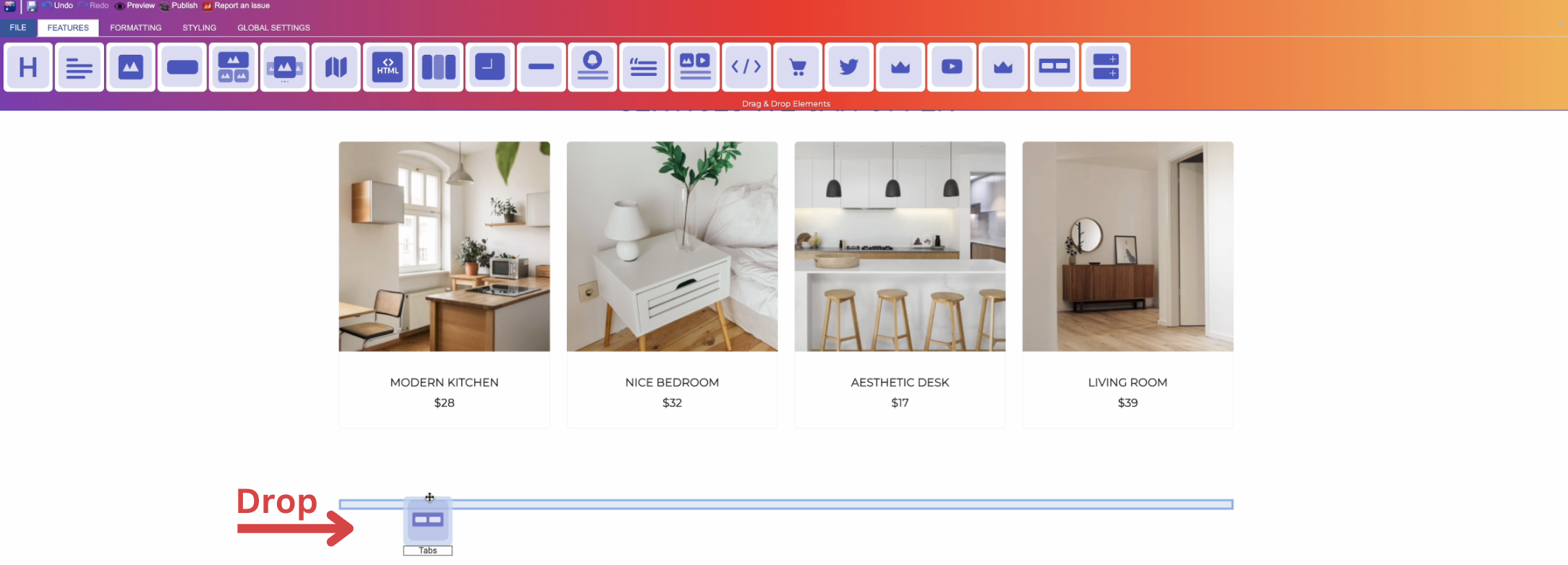
Adding Tabs
- Drag the tabs icon from the available features
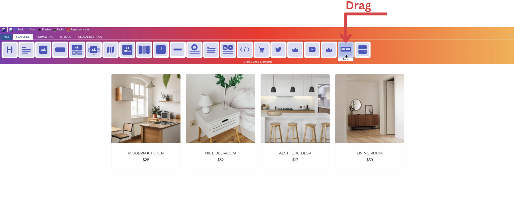
- Drop the tabs icon into the desired location on your website page
Feature Settings
Upon dropping the tabs, a settings window will appear, offering three main features:
-
Themes
-
Explore different themes for your tabs to align with your website's aesthetic.
-
____________________________________________________________________________
-
Settings
- Add number of sections as desired and aligned with your website.
-
Determine your title text and type (text , icon , or text and icon).
- Add content to your sections (optional).
- Determine how your sections are visible on devices (Mobile , Tablet , Desktop , Large desktop).
____________________________________________________________________________
-
Animations
-
Add animation to your tabs from a long list of animation options.
-
Enhance your animated tabs by incorporating timing in seconds.
-
Style Settings
Design Features
-
Access the "Design" feature to customize your tabs appearance. Within this feature, you can determine the following properties:
-
Margin: Set the spacing around your tabs to control its placement on the page.
-
Border: Define a border for your tabs to add a distinct visual element.
-
Color: Choose the color that best complements your website's theme or design.
-
Style: Apply different styles to your tabs, enhancing its visual appeal.
-
Gradient: Add gradient effects to your tabs for a more dynamic and modern look.
-
Background Features
Style Customization
- Within the "Style" section, further refine your tabs presentation by adding classes from a dropdown list with a plethora of options.
- Determine how your tabs are visible on devices (Mobile , Tablet , Desktop , Large desktop.
How to Add Accordions to Your Page ?
Through this document , you will uncover the 'Accordions' feature properties in site editor page through these key elements:
1. Adding Accordions
2. Feature Settings Window
3. Style Settings Window
Adding Accordions
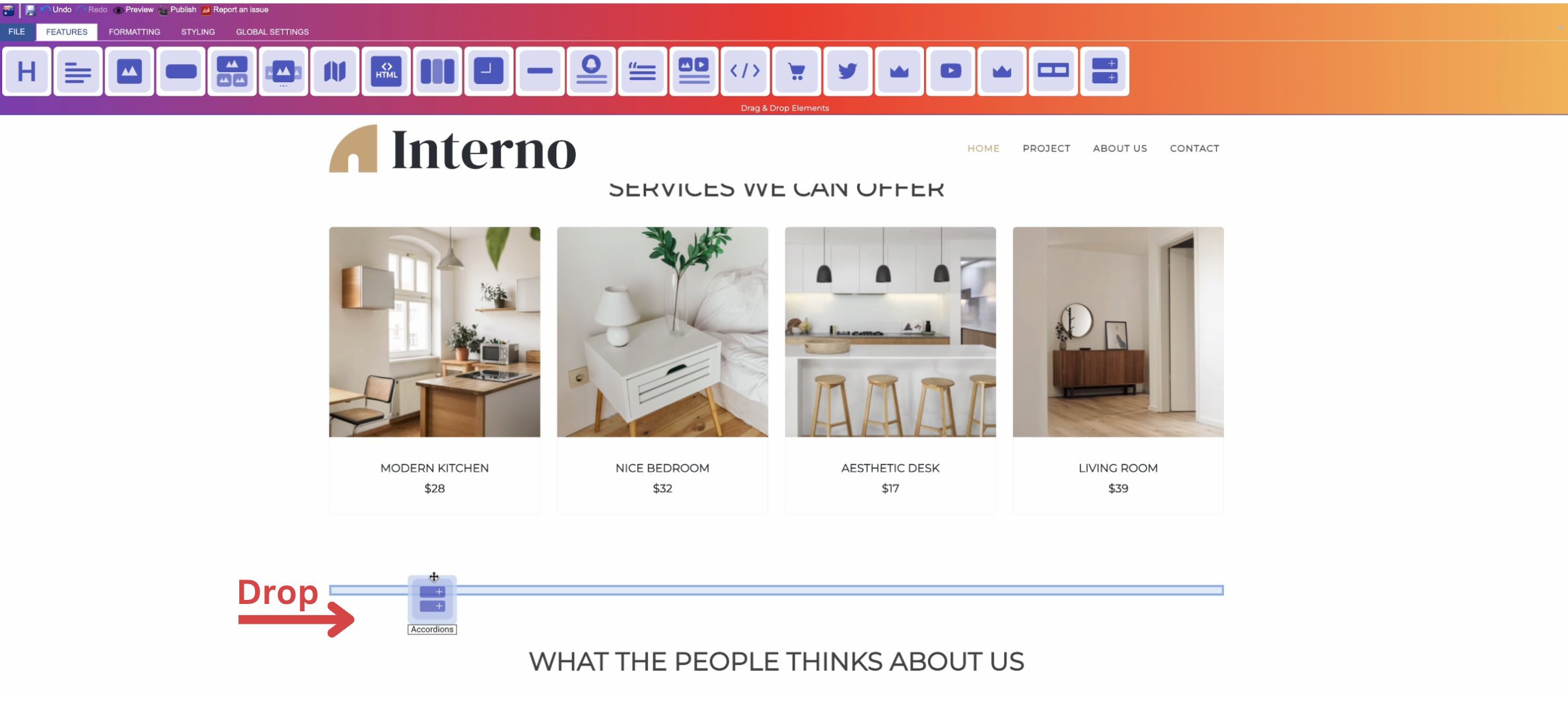
- Drag the accordions icon from the available features
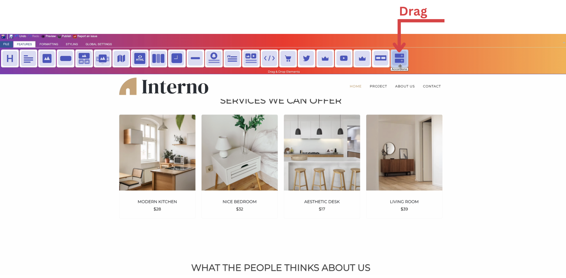
- Drop the accordions icon into the desired location on your website page
Feature Settings
Upon dropping the accordions, a settings window will appear, offering three main features:
-
Themes
-
Explore different themes for your accordions to align with your website's aesthetic.
-
____________________________________________________________________________
-
Settings
- Add number of sections as desired and aligned with your website.
-
Determine your title text and type (text , icon , or text and icon).
- Add content to your sections (optional).
- Determine how your sections are visible on devices (Mobile , Tablet , Desktop , Large desktop).
____________________________________________________________________________
-
Animations
-
Add animation to your accordions from a long list of animation options.
-
Enhance your animated accordions by incorporating timing in seconds.
-
Style Settings
Design Features
-
Access the "Design" feature to customize your accordions appearance. Within this feature, you can determine the following properties:
-
Margin: Set the spacing around your accordions to control its placement on the page.
-
Border: Define a border for your accordions to add a distinct visual element.
-
Color: Choose the color that best complements your website's theme or design.
-
Style: Apply different styles to your accordions, enhancing its visual appeal.
-
Gradient: Add gradient effects to your accordions for a more dynamic and modern look.
-
Background Features
Style Customization
- Within the "Style" section, further refine your accordions presentation by adding classes from a dropdown list with a plethora of options.
- Determine how your accordions are visible on devices (Mobile , Tablet , Desktop , Large desktop.
How to Add Subscribe Feature to Your Page?
Through this document , you will uncover the 'Subscribe' feature properties in site editor page through these key elements:
1. Adding Subscribe
2. Feature Settings Window
3. Style Settings Window
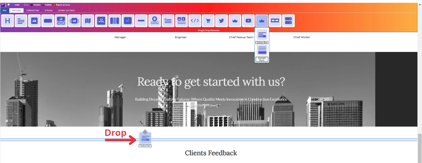
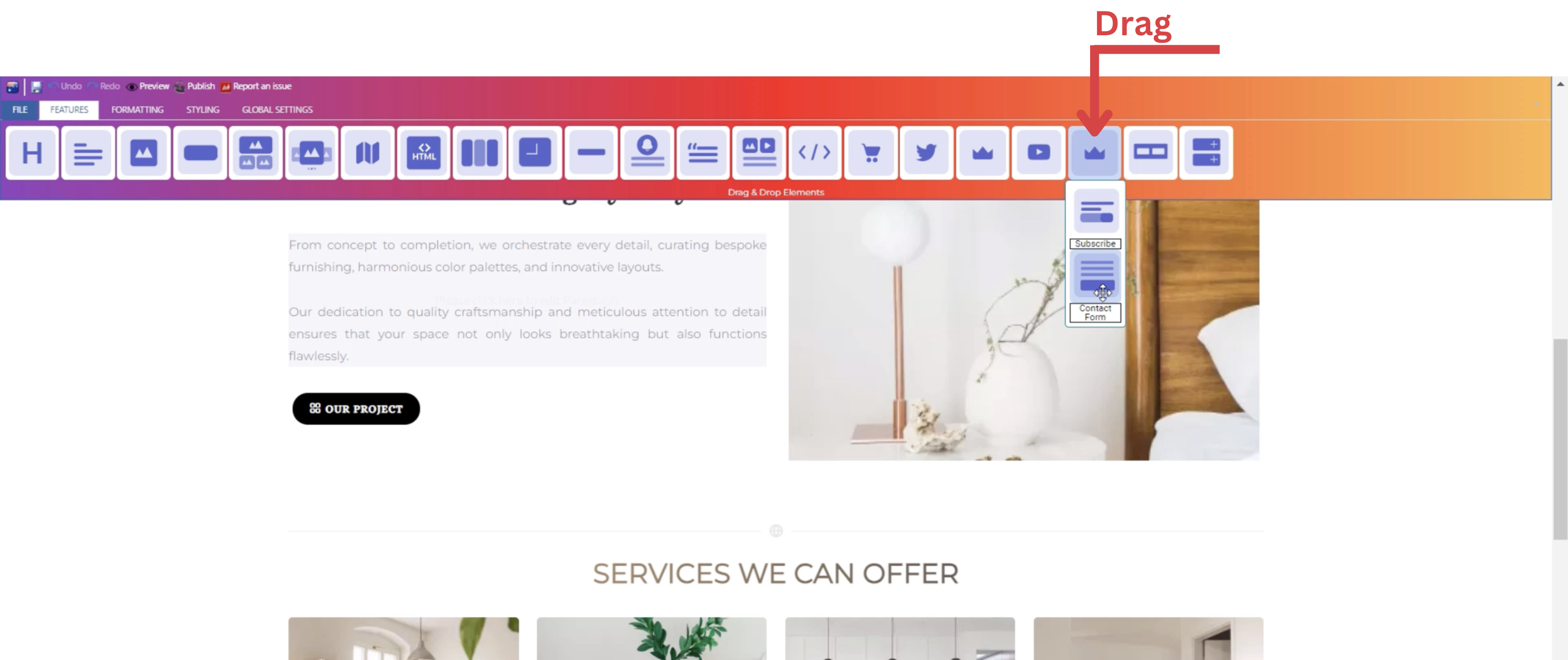
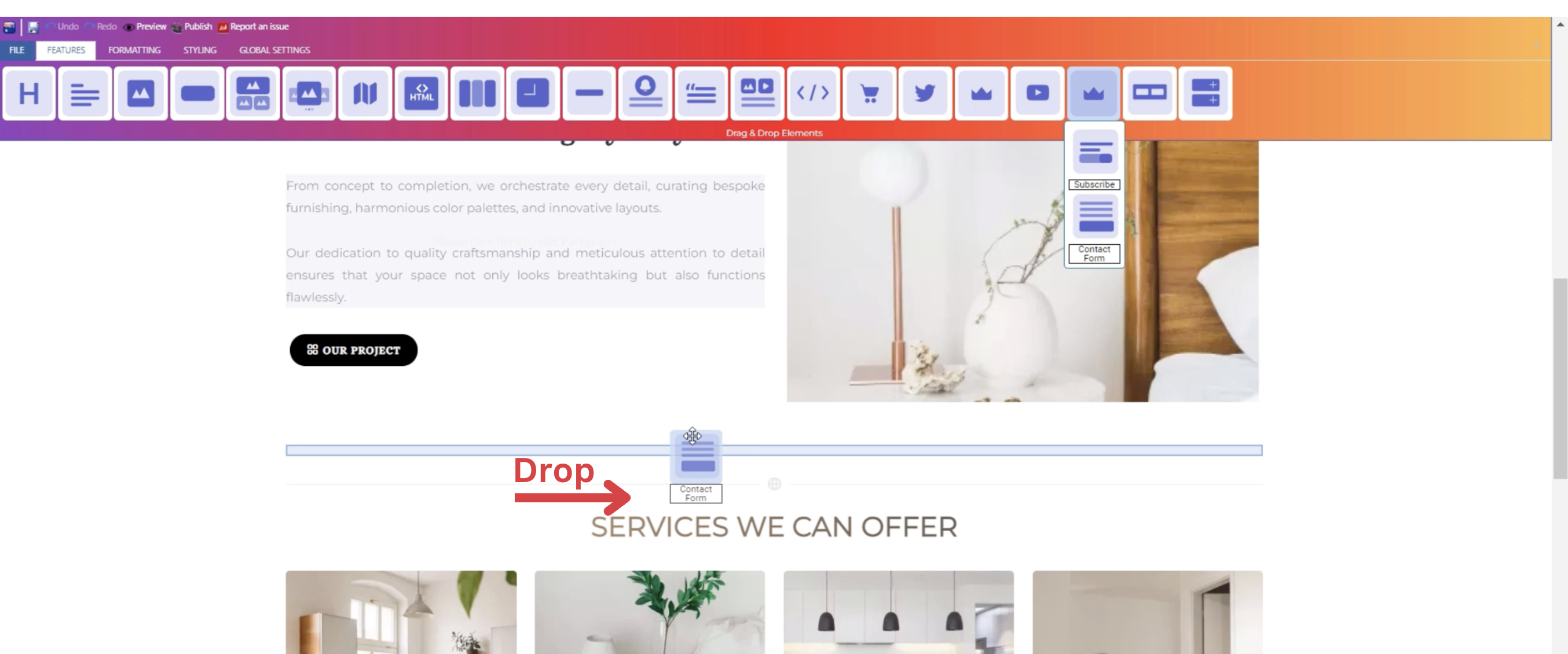
Adding Subscribe
- Drag the subscribe icon from the available features
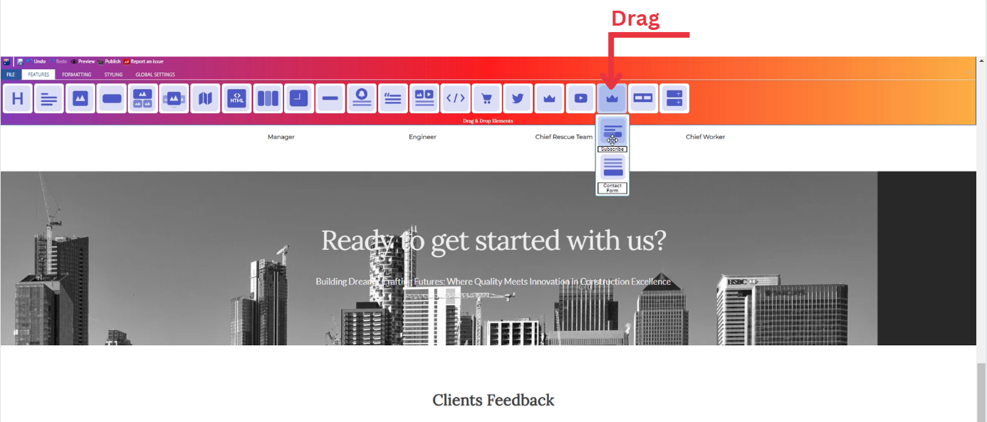
- Drop the subscribe icon into the desired location on your website page
Feature Settings
Upon dropping the subscribe icon, a settings window will appear, offering three main features:
-
Records
-
You will be able to see entries from dashboard which allows you to manage user subscriptions conveniently.
-
-
Settings
- Determine how your subscription box is visible on devices (Mobile , Tablet , Desktop , Large desktop).
- Animations
-
-
-
Add animation to your subscription box from a long list of animation options.
-
Enhance your animated subscription box by incorporating timing in seconds.
-
-
Style Settings
Design Features
-
Access the "Design" feature to customize your subscription box appearance. Within this feature, you can determine the following properties:
-
Margin: Set the spacing around your subscription box to control its placement on the page.
-
Border: Define a border for your subscription box to add a distinct visual element.
-
Color: Choose the color that best complements your website's theme or design.
-
Style: Apply different styles to your subscription box, enhancing its visual appeal.
-
Gradient: Add gradient effects to your subscription box for a more dynamic and modern look.
-
Background Features
Style Customization
- Within the "Style" section, further refine your subscription box presentation by adding classes from a dropdown list with a plethora of options.
- Determine how your subscription box are visible on devices (Mobile , Tablet , Desktop , Large desktop).
How to Add Contact Form to Your Page ?
Through this document , you will uncover the 'Contact Form' feature properties in site editor page through these key elements:
1. Adding a Contact Form
2. Feature Settings Window
3. Style Settings Window
Adding a Contact Form
- Drag the contact form icon from the available features
- Drop the contact form icon into the desired location on your website page
Feature Settings
Upon dropping the subscribe icon, a settings window will appear, offering three main features:
-
Records
-
You will be able to see entries from dashboard which allows you to manage contact form conveniently.
-
-
Settings
- Determine how your contact form is visible on devices (Mobile , Tablet , Desktop , Large desktop).
- Determine how your contact form is visible on devices (Mobile , Tablet , Desktop , Large desktop).
- Animations
-
Add animation to your contact form from a long list of animation options.
-
Enhance your animated contact form by incorporating timing in seconds.
-
Style Settings
Design Features
-
Access the "Design" feature to customize your contact form appearance. Within this feature, you can determine the following properties:
-
Margin: Set the spacing around your contact form to control its placement on the page.
-
Border: Define a border for your contact form to add a distinct visual element.
-
Color: Choose the color that best complements your website's theme or design.
-
Style: Apply different styles to your contact form, enhancing its visual appeal.
-
Gradient: Add gradient effects to your contact form for a more dynamic and modern look.
-
Background Features
Style Customization
- Within the "Style" section, further refine your contact form presentation by adding classes from a dropdown list with a plethora of options.
- Determine how your contact form are visible on devices (Mobile , Tablet , Desktop , Large desktop).